Sense: A super modular design system built from grounds up
Sense: A super modular design system built from grounds up
Jupiter - Sense
A super modular design system built from grounds up
Design system
strategy

What is Sense Design System?
The Sense Design System is like a Lego set, providing reusable UI components and clear guidelines specifically tailored for React Native apps. It ensures consistent, high-quality interfaces across Android and iOS, streamlining development and aligning digital experiences with Jupiter Money’s standards for performance, aesthetics, and usability. Sense eliminates redundant work, enabling teams to focus on innovation, collaborate efficiently, and deliver cohesive, scalable, and optimized mobile experiences.
The Sense Design System is like a Lego set, providing reusable UI components and clear guidelines specifically tailored for React Native apps. It ensures consistent, high-quality interfaces across Android and iOS, streamlining development and aligning digital experiences with Jupiter Money’s standards for performance, aesthetics, and usability. Sense eliminates redundant work, enabling teams to focus on innovation, collaborate efficiently, and deliver cohesive, scalable, and optimized mobile experiences.
My role included leading the entire project end-to-end,
working with 30 developers and 20 product designers.
4 months of duration
A brief history
Redesigns spark innovation. At Jupiter, our goal was to create India’s best-designed financial app. Transitioning from a playful planetary spaceman theme to a mature and trustworthy UI/UX required the creation of Sense, a modular and scalable design system. Sense replaced the outdated Europa, enabling seamless and reliable experiences.
Redesigns spark innovation. At Jupiter, our goal was to create India’s best-designed financial app. Transitioning from a playful planetary spaceman theme to a mature and trustworthy UI/UX required the creation of Sense, a modular and scalable design system. Sense replaced the outdated Europa, enabling seamless and reliable experiences.
Guiding Principles
Principles guided our journey toward a shared vision:
Prioritize Ease of Use: Ensuring accessibility and usability of styles, components, and code.
Align Design with Code: Maintaining consistency by closely aligning design and code libraries.
Conviction in Craft: Simplifying complexity and upholding high standards consistently.
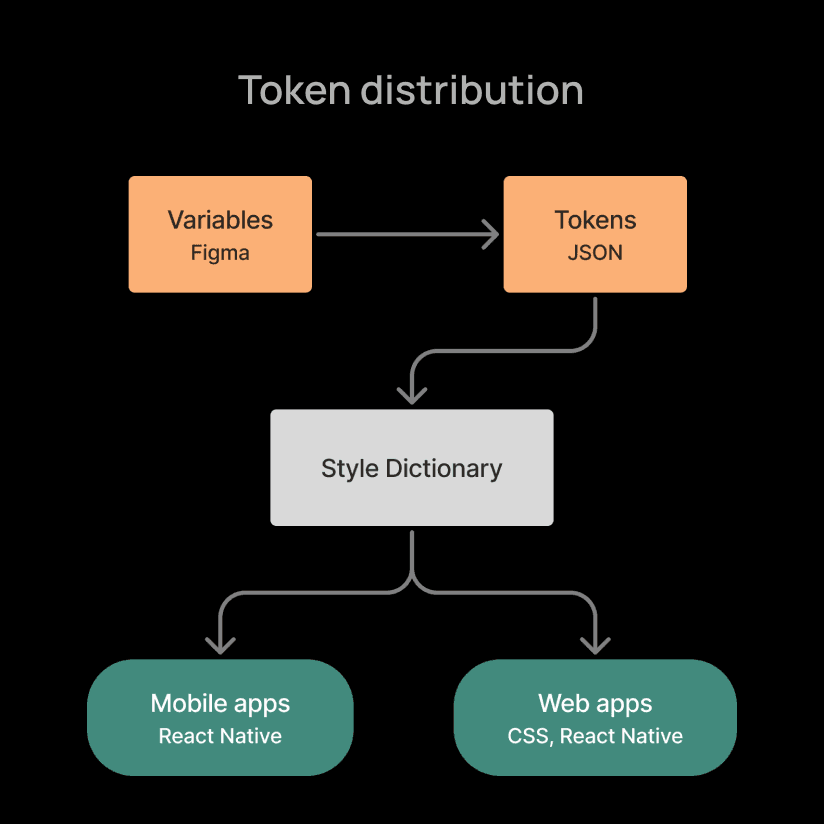
Tokens
Design tokens express design decisions in a platform-agnostic manner, establishing a common language for designers and developers. Tokens are categorized broadly into universal, alias, and component levels, and can be expanded as needed. Storing tokens in a code repository improves efficiency, simplifies updates, and fosters easy collaboration between design and engineering teams.
Design tokens express design decisions in a platform-agnostic manner, establishing a common language for designers and developers. Tokens are categorized broadly into universal, alias, and component levels, and can be expanded as needed. Storing tokens in a code repository improves efficiency, simplifies updates, and fosters easy collaboration between design and engineering teams.


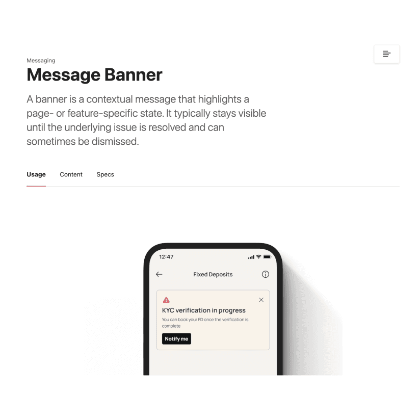
Components, patterns and assets
Components form the essential building blocks, ensuring consistent UI across screens, products, and platforms. They are modular, scalable, and customizable, incorporating motion when beneficial.
Standardizing common design patterns—such as FAQs, settings, empty states, success/error screens, loading screens, and validation messages—has reduced redesign effort by nearly 20%.
Asset management was optimized by centralizing repositories for consistency, smaller file sizes, and faster rendering. Icons were provided as a font within the component library, updated regularly, while other assets and illustrations were managed via Figma and Playbook.

Documentation
A documentation covering the introduction, best practices, usage guidelines, and content standards for top components and patterns is published, with full library support planned by end of CY2025.
A documentation covering the introduction, best practices, usage guidelines, and content standards for top components and patterns is published, with full library support planned by end of CY2025.
Accessibility
Dark Mode
Initially tested with a select user group, dark mode enhanced visual accessibility for users with light sensitivity and visual impairments, despite being temporarily withdrawn for business considerations.
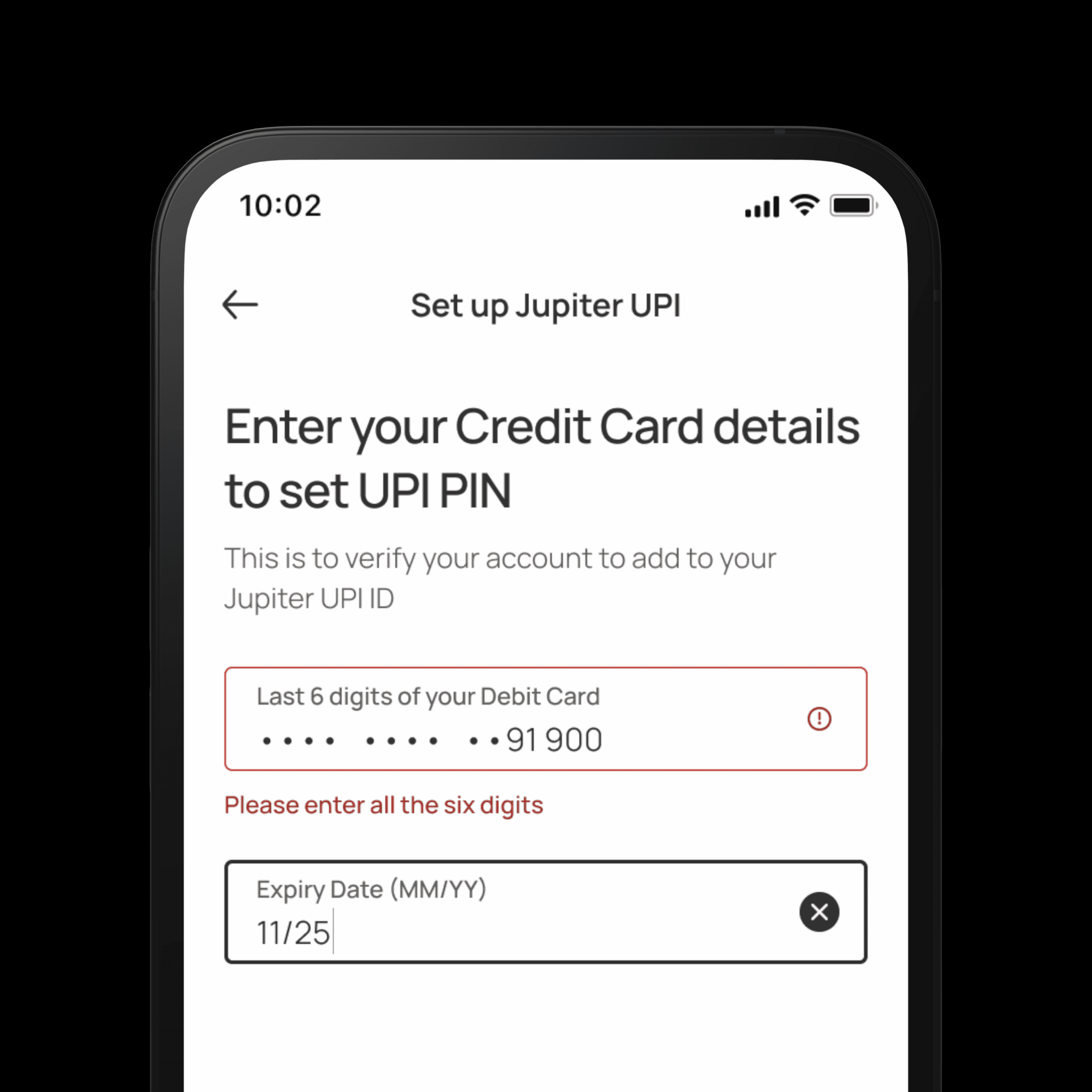
Validation Cues
Clear validation messages accompany color cues in form inputs to accommodate users with color blindness, particularly protanopia.
Selection Cues
Thicker borders highlight focused interactive elements, ensuring clear visibility without relying solely on color.
Dark Mode
Initially tested with a select user group, dark mode enhanced visual accessibility for users with light sensitivity and visual impairments, despite being temporarily withdrawn for business considerations.
Validation Cues
Clear validation messages accompany color cues in form inputs to accommodate users with color blindness, particularly protanopia.
Selection Cues
Thicker borders highlight focused interactive elements, ensuring clear visibility without relying solely on color.
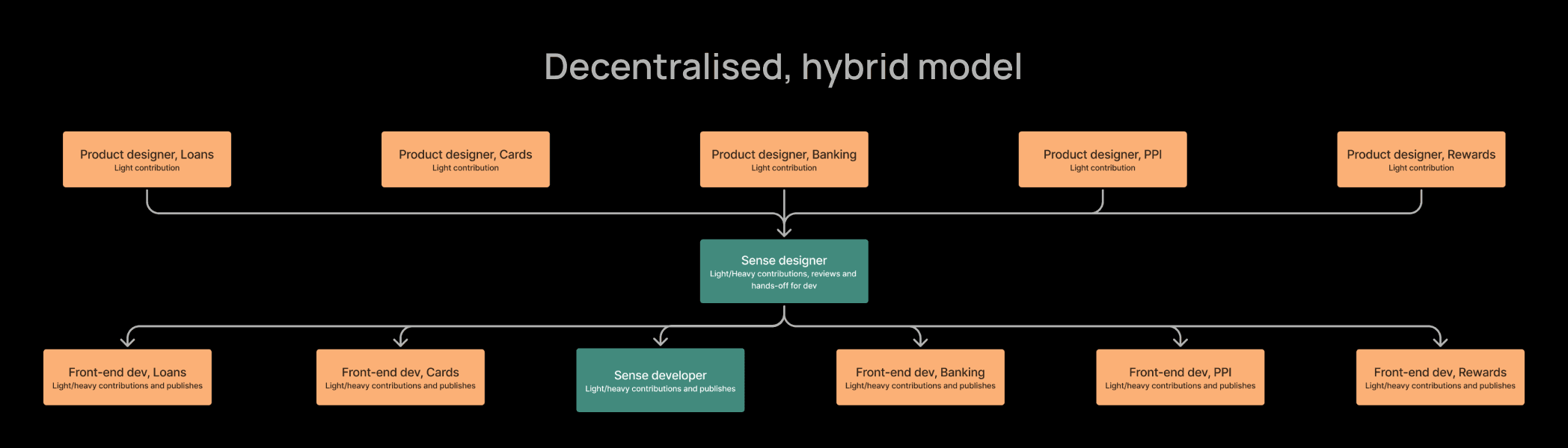
Governance
A decentralised, hybrid model was employed to govern the various everyday aspects. This provides us with a single source of truth, local ownership, bias to adopt before invent and transparent decision making.
A decentralised, hybrid model was employed to govern the various everyday aspects. This provides us with a single source of truth, local ownership, bias to adopt before invent and transparent decision making.


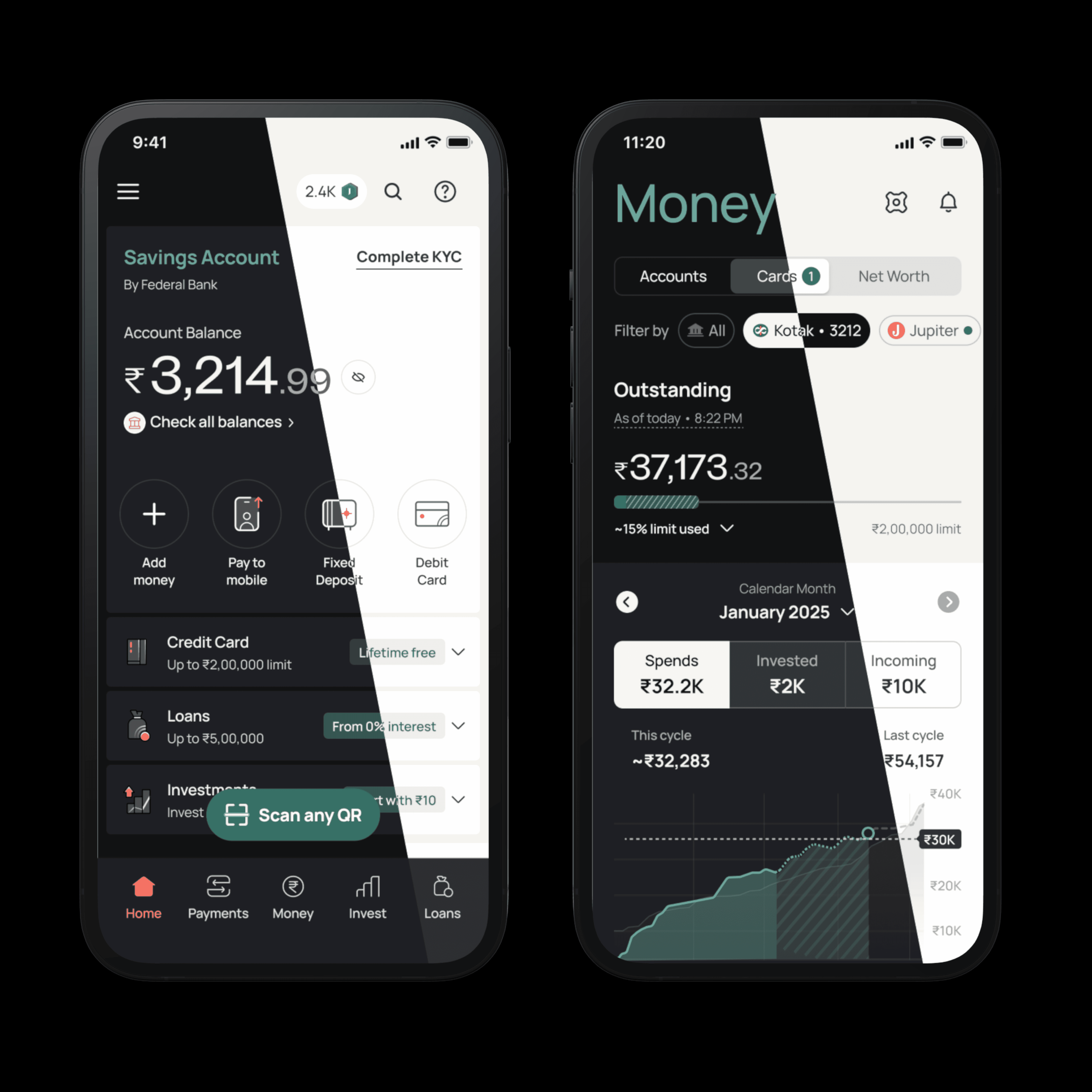
Mobile Screens
Impact
Efficiency
Sense significantly boosted organizational efficiency, cutting design and development turnaround times by over 100%, resulting in an estimated 400% overall efficiency gain.
Code reduction
Redesigning just 20% of the app eliminated over 100,000 lines of code, with projections reaching 1,000,000 lines upon full implementation. This greatly enhanced performance and user experience.
Cultural Integration
Sense became deeply embedded within company culture, recognized universally as a strategic tool driving innovation and efficiency.
Credits
role
Design system
Strategy
Motion design
Product design
Validation
Tools
Figma
Confluence
zeroheight
Token studio
team
Design
Dilip Merugu
Engineering
Udasi Tharani
Explore next


Lights on·off