Rupeek: Building India's first Gold powered card

Rupeek: Building India's first Gold powered card

Rupeek - Card

Bringing a secured credit card product to India's underserved market with focus on delight

Product design

Design system

Motion design

What is Rupeek card and how is it different from other credit cards?

Rupeek is India's leading asset-backed digital lending fintech platform. As of writing this (July 2023), the asset it relies on for securing loans is Gold. Organised Gold loans is a 6 Trillion USD market and Rupeek served a mighty 1% of it.


The Cards, however is a new initiative built to make credit cards more accessible to customers who cannot otherwise get one. This is achieved by issuing a card for which the spending limit is secured with the Gold pledged by the customers. Rupeek partnered with Bank of India (BOI) to build this product.

Stephen Mayer, a Salt Lake City native, was nurtured in the publishing world by his magazine-running father and developed a fascination for fonts upon receiving a Mac for his family. During his collegiate years, he skipped lectures and gained knowledge about typeface—and life—by working as a designer for his university newspaper.


He also worked independently as a consultant, bridging the gap between typeface creators and users, always championing the needs of both parties. Not only is he the co-founder of the web platforms, Typographica and Fonts In Use, Stephen has also penned a regular column for Print magazine and authored the acclaimed book The Anatomy of Type. In 2017, he became an integral part of the nonprofit library and museum, Letterform Archive, as an Associate Curator and Editorial Director.

Goal

To build a visually delightful experience for Rupeek's new product's (Rupeek cards) customers on mobile while carefully adhering to the strict and ever changing guidelines involved in a co-branded card.

Stephen Mayer, a Salt Lake City native, was nurtured in the publishing world by his magazine-running father and developed a fascination for fonts upon receiving a Mac for his family. During his collegiate years, he skipped lectures and gained knowledge about typeface—and life—by working as a designer for his university newspaper.


He also worked independently as a consultant, bridging the gap between typeface creators and users, always championing the needs of both parties. Not only is he the co-founder of the web platforms, Typographica and Fonts In Use, Stephen has also penned a regular column for Print magazine and authored the acclaimed book The Anatomy of Type. In 2017, he became an integral part of the nonprofit library and museum, Letterform Archive, as an Associate Curator and Editorial Director.

Product Complexity

While the product we are building might sound pretty straightforward, it certainly isn't. India's central bank and regulatory body, RBI publishes the digital lending guidelines which are applicable for all banks and NBFCs.


These guidelines restrict Rupeek from storing any customer data such as transactions, account details, KYC details, etc,. Even the account verification capabilities or any authentication layers cannot be present on Rupeek's end. To work around this, Rupeek worked with its partner to build an SDK that existed on Bank's servers and can communicate with Rupeek's cards app whenever needed. The data is fetched only on demand. This meant that the customers need to go through an authentication process every time they have to access their data.

Stephen Mayer, a Salt Lake City native, was nurtured in the publishing world by his magazine-running father and developed a fascination for fonts upon receiving a Mac for his family. During his collegiate years, he skipped lectures and gained knowledge about typeface—and life—by working as a designer for his university newspaper.


He also worked independently as a consultant, bridging the gap between typeface creators and users, always championing the needs of both parties. Not only is he the co-founder of the web platforms, Typographica and Fonts In Use, Stephen has also penned a regular column for Print magazine and authored the acclaimed book The Anatomy of Type. In 2017, he became an integral part of the nonprofit library and museum, Letterform Archive, as an Associate Curator and Editorial Director.

Solution

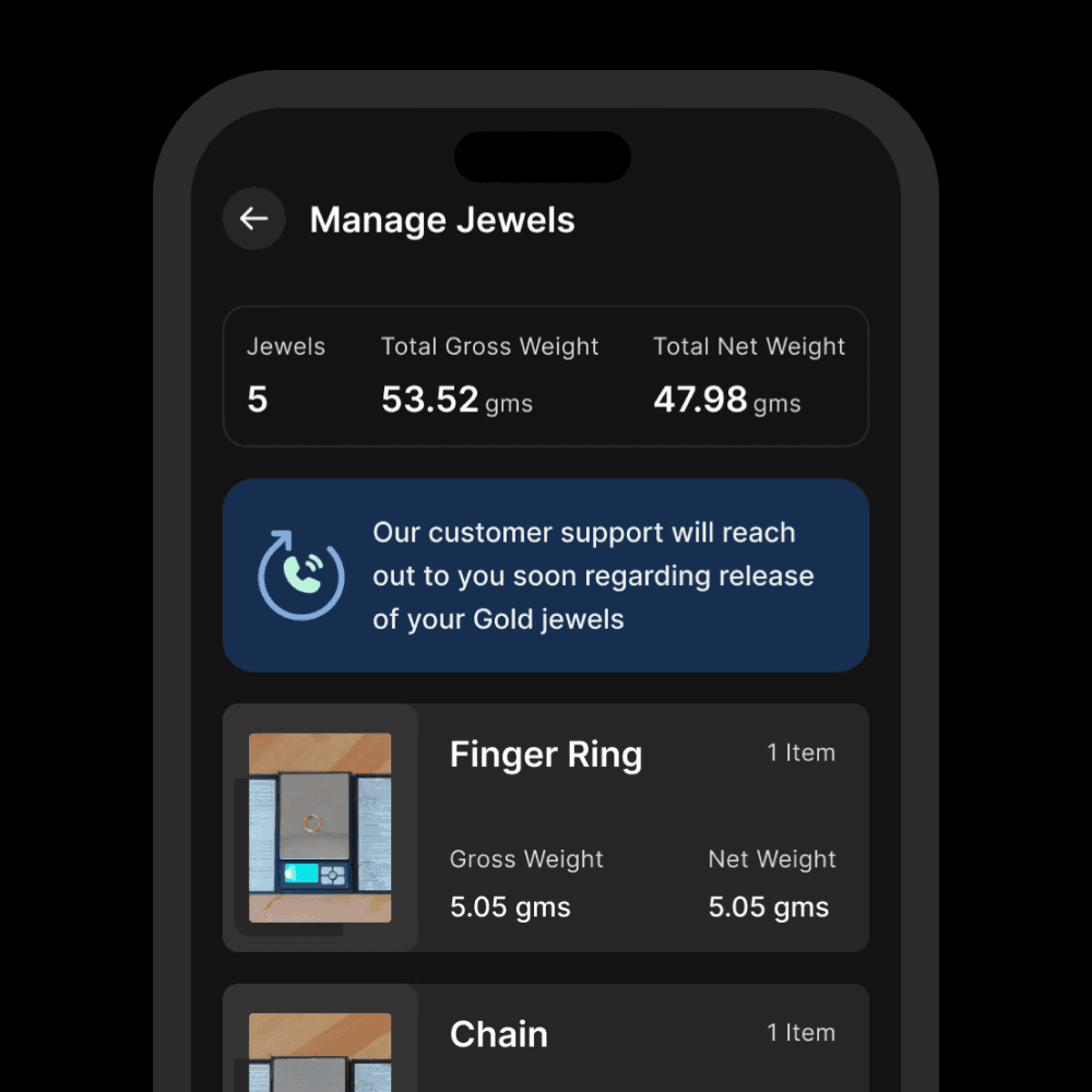
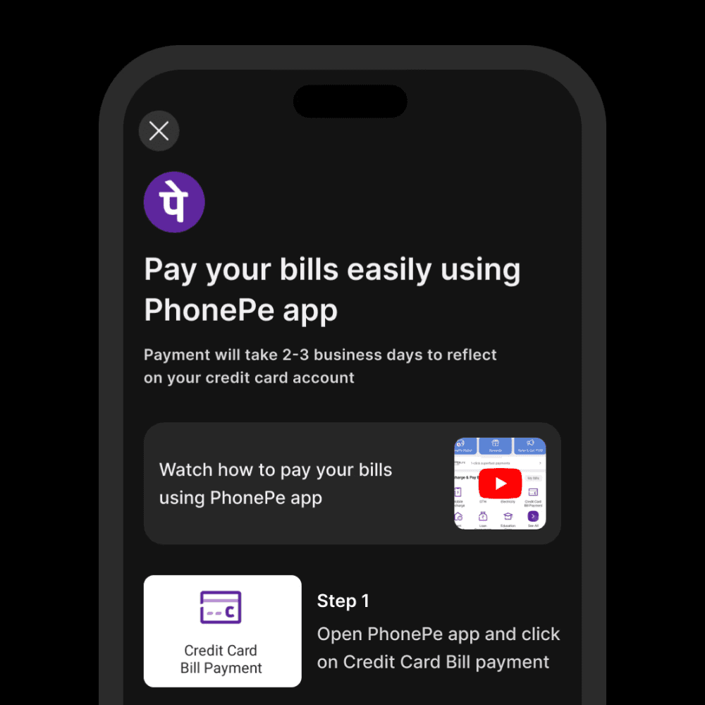
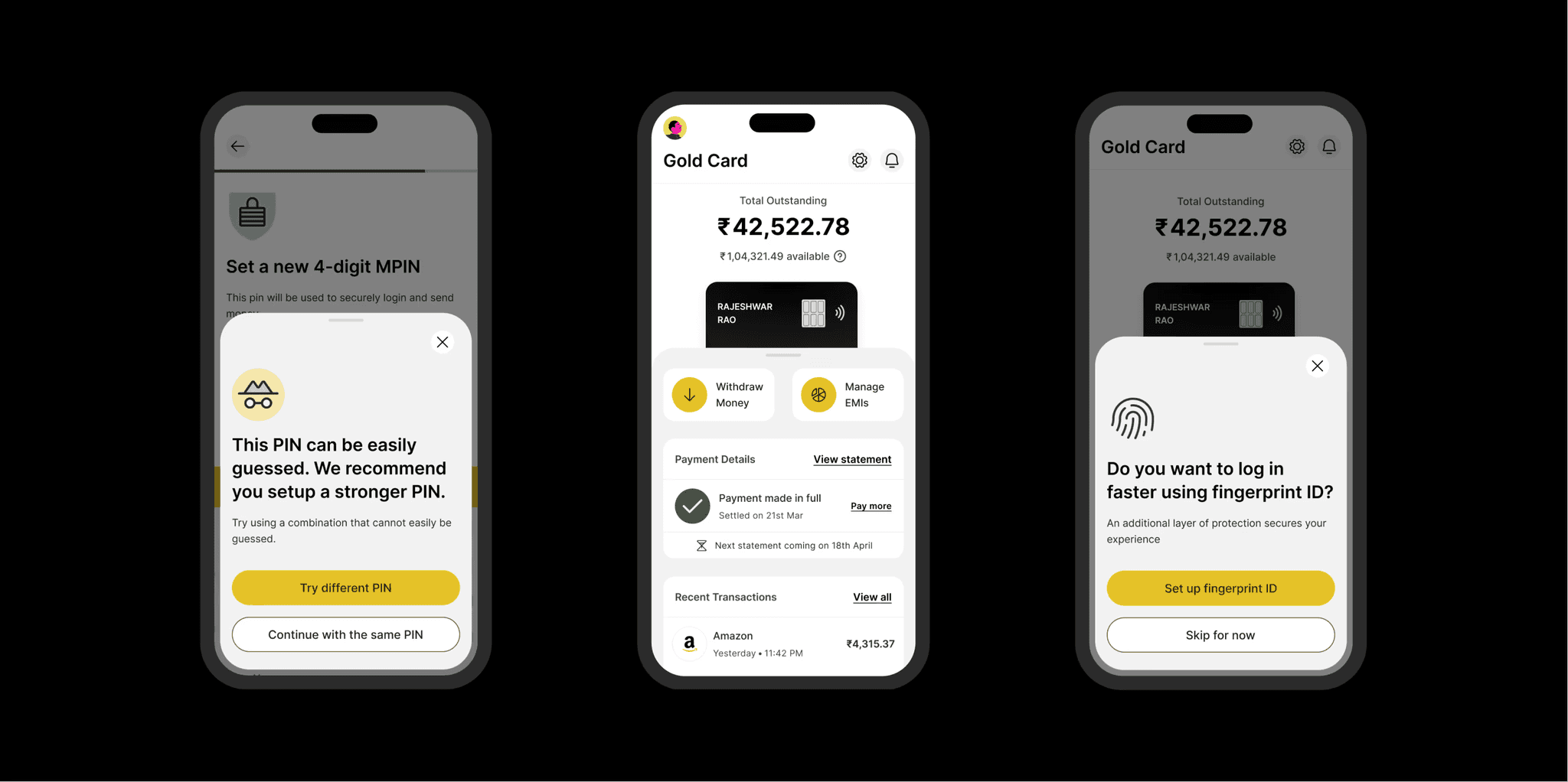
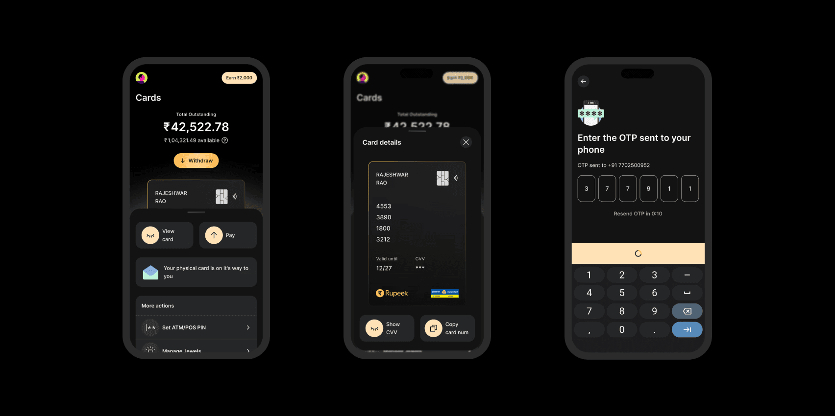
In our initial visual direction explorations and testing (at least 5 of them, very different were considered), we learned that the business and the customers are gravitating towards a darker theme with a clean design and golden accent for the mobile app.


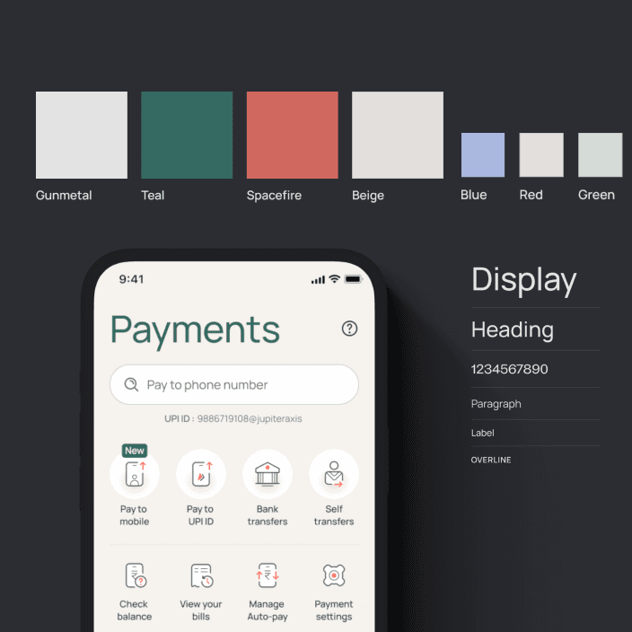
Building a visually rich experience needed an equally competent and powerful design system. The Gravity 1.0 which was (and still is, as of writing this) our design system serving the Gold loans segment worked amazing for its customers, but needed a major overhaul to support this new product.


So, we built every style and component from the ground up (Gravity 2.0) with focus on AAA accessibility, motion, and delight.

Stephen Mayer, a Salt Lake City native, was nurtured in the publishing world by his magazine-running father and developed a fascination for fonts upon receiving a Mac for his family. During his collegiate years, he skipped lectures and gained knowledge about typeface—and life—by working as a designer for his university newspaper.


He also worked independently as a consultant, bridging the gap between typeface creators and users, always championing the needs of both parties. Not only is he the co-founder of the web platforms, Typographica and Fonts In Use, Stephen has also penned a regular column for Print magazine and authored the acclaimed book The Anatomy of Type. In 2017, he became an integral part of the nonprofit library and museum, Letterform Archive, as an Associate Curator and Editorial Director.

How did design help?

Visual Identity & Emotional Connection

The new dark theme with golden accents wasn’t just about aesthetics—it reinforced the premium nature of the product. The golden touch resonated with the underlying asset (Gold) and helped instill a sense of security and trust among users.

Streamlined User Experience


Despite the inherent complexity brought by strict RBI guidelines (like not storing sensitive customer data and relying on multi-step authentication), we crafted an experience that minimized perceived friction. Every step of the process—from checking balances to updating MPIN—was thoughtfully designed to be engaging and clear, ensuring that users felt confident and in control.

Consistent and Accessible Design System (Gravity 2.0)


The overhaul from Gravity 1.0 to Gravity 2.0 was pivotal. By building every style and component from the ground up with a focus on AAA accessibility and delightful motion, the design system: • Ensured a consistent experience across various touchpoints, reducing user confusion. • Made complex interactions feel natural and fluid, even when users had to re-authenticate for every data fetch. • Contributed directly to the improved conversion rates and user satisfaction scores.

Engagement Through Micro-Interactions


The design’s attention to micro-interactions and subtle animations helped guide users through complex flows, turning potentially cumbersome steps into engaging experiences. This not only kept users informed but also helped them feel more connected to the product, ultimately driving repeat usage.

Stephen Mayer, a Salt Lake City native, was nurtured in the publishing world by his magazine-running father and developed a fascination for fonts upon receiving a Mac for his family. During his collegiate years, he skipped lectures and gained knowledge about typeface—and life—by working as a designer for his university newspaper.


He also worked independently as a consultant, bridging the gap between typeface creators and users, always championing the needs of both parties. Not only is he the co-founder of the web platforms, Typographica and Fonts In Use, Stephen has also penned a regular column for Print magazine and authored the acclaimed book The Anatomy of Type. In 2017, he became an integral part of the nonprofit library and museum, Letterform Archive, as an Associate Curator and Editorial Director.

Impact

Rapid Adoption


  • Over 5,000 credit cards issued in just the first three months, demonstrating strong market traction. 100% of the onboarded through the app seamlessly.

  • Achieved a 20% boost in the application-to-approval conversion rate by reducing friction in the onboarding process.

User Engagement & Satisfaction


  • Clocked about 34% daily active users (DAUs) and ~50% monthly active users signalling higher engagement with the app.

  • Post-launch surveys, primarily done through customer calling reported that nearly 90% of users praising the app’s premium look and intuitive navigation.

Trust & Conversion


  • The seamless integration of the partner's SDK (required for secure data access) into the app was so intuitive that it contributed significantly to building trust and repeat usage among customers.

Stephen Mayer, a Salt Lake City native, was nurtured in the publishing world by his magazine-running father and developed a fascination for fonts upon receiving a Mac for his family. During his collegiate years, he skipped lectures and gained knowledge about typeface—and life—by working as a designer for his university newspaper.


He also worked independently as a consultant, bridging the gap between typeface creators and users, always championing the needs of both parties. Not only is he the co-founder of the web platforms, Typographica and Fonts In Use, Stephen has also penned a regular column for Print magazine and authored the acclaimed book The Anatomy of Type. In 2017, he became an integral part of the nonprofit library and museum, Letterform Archive, as an Associate Curator and Editorial Director.

Credits

role

Product design

Design system

Motion design

Icon design

Prototyping

Tools

Figma

Confluence

Adobe After Effects

Adobe Illustrator

team

Product

Krishna Chaitanya

Design

Dilip Merugu

Vishnu Shenoy

Business

Amit Maniyar

Engineering

Raghunathan
Get in touch

Send an email at dilipmerugu@gmail.com or DM via Whatsapp and I'll get back to you asap.

All rights reserved © 2025 dilip.design

Get in touch

Send an email at dilipmerugu@gmail.com or DM via Whatsapp and I'll get back to you asap.

All rights reserved © 2025 dilip.design

Get in touch

Send an email at dilipmerugu@gmail.com or DM via Whatsapp and I'll get back to you asap.

All rights reserved © 2025 dilip.design

Lights on·off